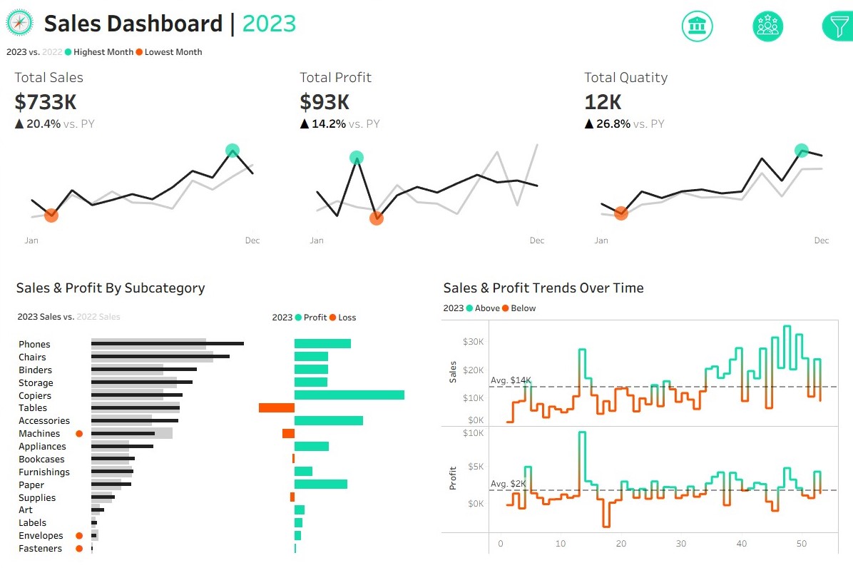
Sales and Customer Dashboards Project: Tableau Public
Developed dual dashboards in Tableau integrating four datasets for advanced sales and customer insights. Delivered dynamic KPIs, YoY and ranked analytics, and interactive distribution visualisations using calculated fields, parameters, and dual-axis charts. Enhanced user experience with image-based navigation, responsive filters, and best-practice dashboard interactivity. The solution showcases modern data modelling, interactive storytelling, and actionable business intelligence for decision-makers.
Exploratory Data Analysis Project: SQL Server
This project conducts exploratory data analysis (EDA) on sales data using advanced SQL techniques, including window functions, joins, and CTEs, to perform magnitude, ranking, temporal, cumulative, performance, segmentation, and part-to-whole analyses. Built on a data warehouse’s gold layer, it generates customer and product reports with key metrics using SQL Server Express and SSMS. Hosted on GitHub under the MIT Licence, it demonstrates technical proficiency in data analytics for portfolio inclusion.

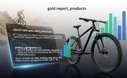
Data Warehouse Project: SQL (SQL Server)
This project showcases a modern data warehousing and analytics solution using SQL Server, implementing a medallion architecture with bronze, silver, and gold layers to process ERP and CRM data. It features ETL pipelines, star schema data modeling, and SQL-based analytics for insights into customer behavior, product performance, and sales trends. Hosted on GitHub under the MIT License, it includes documentation, open-source datasets, and free tools like SQL Server Express and DrawIO.

Airbnb Seattle Prices Dashboard: Tableau Public
A Tableau project visualising Seattle Airbnb data, featuring interactive dashboards to explore listings, pricing, and trends. It leverages public data to uncover insights through dynamic visualisations. Location and number of bedrooms played a key role in defining listing price. Hosted on Tableau Public with accessible dashboards.

Regional CO2 Production Dashboard: Tableau Public
A Tableau project visualising global CO₂ production per capita and total emissions by region from 1960 to 2011. It uses public data to create interactive dashboards for exploring trends and patterns in emissions. It was intriguing analysing the emissions prior to China's rapid industrialisation. Hosted on Tableau Public with accessible visualizations.

World Layoffs Data Cleaning and Analysis: SQL (MySQL)
A MySQL project analysing global layoff data, using staging tables to preserve raw CSV, cleaning scripts for whitespace, NULLs, and duplicates, and EDA with CTEs, window functions, and aggregates. It identifies a Q2 2023 layoff spike, with tech (40%) and North America hit hardest. Hosted on GitHub with setup instructions.

Customer Call List Data Cleaning: Python (Pandas)
A Python project using Pandas to clean a Customer Call List dataset for a contact center. It removes duplicates, standardises phone numbers and names, splits addresses, handles missing values, and filters irrelevant rows. The cleaned data is saved as an Excel file, with code and instructions provided in a Jupyter Notebook on GitHub.

Data Professionals Survey Dashboard: Power BI
A Power BI project cleaning, analysing and visualising data professional survey data from an Excel dataset. It employs Power Query Editor to eliminate duplicates, standardise formats, and transform salary data, followed by analysis with measures for salary, age, and job satisfaction. Interactive dashboards with gauges, bar charts, and treemaps highlight trends like Python’s popularity and salary disparities. Hosted on GitHub with setup instructions.

Bike Sales Dashboard: Excel
An Excel project cleaning, analysing, and visualising bike sales data. It starts with data cleaning in a dedicated sheet to standardise headers, remove duplicates, and add derived columns like age brackets. PivotTables then analyse purchase trends by demographics and commute distance, followed by visualisation in an interactive dashboard with PivotCharts and slicers. Hosted on GitHub with setup instructions.